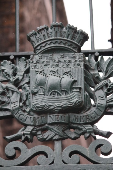
LES ARMOIRIES DE PARIS
Place: de la République
Paris has a byline. It has been in use since the 1300s, variously carved or tiled into buildings in characters now weathered and indistinct. From Latin, it means "tossed but not sunk” in the sense of a boat being slapped sideways in rough water. It had fallen out of fashion, mostly because it’s a little obtuse, a little nautical, and it's hard to get behind a dorky boat the local government clip-arts to the bottom of press releases.
But then four young men opened fire on a crowd of university students in a sold-out concert hall. The day after, someone took those words and superimposed them over a photo of the tower and threw it on insta. The timing was right, the message was unequivocal and now it is everywhere, on social media feeds and posters, pasted in alleys and scribbled in toilets.
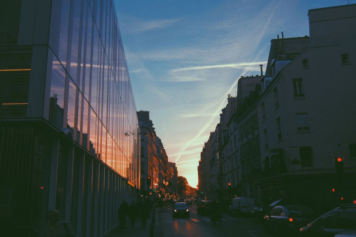
Here, now, it is written in giant white letters over a wall that has been painted entirely black. The letter forms are elegant serifs rendered a metre high and, although the building is edged with all the pageantry of the Belle Époque, this blocking of solid black renders one face crisp and essential. Fluctuat nec mergitur. A giant chalkboard with intent.
The last time I stood here, an old man stopped in front of me, set down his bag of groceries, and stared at the wall, hands on hips. It was then covered by a well-rendered piece of street art - a girl with flaming red hair, floating gently above the ground. He stood quietly for a moment, then stooped to gather his groceries. Today it is just me, the rain, and the giant letters. I look across the road at the bar I know lies behind an anonymous green door.
“We went there every week. Religiously. It was the closest I think any of us had to a living room. Friends, not customers. I know that’s a stereotype, but that’s what it was. And then the shooting started and everyone’s phone went off all at once. We locked the doors and went down to the basement. Stayed there refreshing facebook while our batteries ran out. The sound of gunshots and sirens outside. It was the most scared I’ve ever been.”
It seems they’ve drained the Canal Saint Martin and the surrounding area has a lingering funk. At the bottom of the canal, mud-encrusted shapes are like the outlines of buried treasures in the formative stages of an archaeological dig. Here the shape of a scooter, a shopping trolley, a bicycle with its edges smoothed by heaped empty bottles pebbled like dinosaur skin in the mud, ready to emerge from hibernation. Tossed but not sunk.
Pathways
One
One of the first genuinely striking uses of VR I saw was a short film the New York Times produced using footage from candlelight vigils at the Place de la République. "Using this medium, we aimed to create a more textured experience — the streets of Paris distilled to voices and spaces."
Paris is a city that lends itself to this kind of storytelling, to texture and space. I think it's also why the giant type treatment worked so well, it stripped texture, the flat forms in stark contrast to those carved almost directly opposite.
Two
I often wonder when the backlash against minimalist logotype will come. I expect it will be soon. In this grimdark era of design austerity where companies fall over each other in the race to pare back their logos to the point we are left squinting at a sea of chiselled black-on-white slab serifs, I think we are due a touch of the ornate.
This time, I hope the skeumorphic tends toward the heraldic. I want giant shields emblazoned with garish colours and leering pictographs. I want overwrought drop caps and outlandish ligatures. I want a border of carefully lettered greenery around every illustration and I want those illustrations to put the Pre-Raphaelites to shame.
I want the dorky boats.
It's not just Paris, all of France does this well. Every city or village has a coat of arms, a blason, and there are hundreds of websites cataloguing the many thousands of beautiful and bizarre things the designers of yore have felt significant enough to whack on a shield. Take the Bas Rhin region for example, where there are more than five hundred different coats of arms for an area about the size of the ACT.
These range from the simple (a sash of yellow across a shield of red) to the complex (a strutting rooster launches itself off a mountain in front of a black sky); and the banal (a pair of black tongs on a silver shield) to the inscrutable (some bloke has draped himself inside the spokes of a golden wheel and is either grinning or grimacing, it's kind of hard to tell).
My favourite is that of Uttwiller, a commune of about 180 people in the far north east of France, right on the German border. Their coat of arms is simply and inexplicably a red felt hat with little dangly bits to cover the ears.
Three
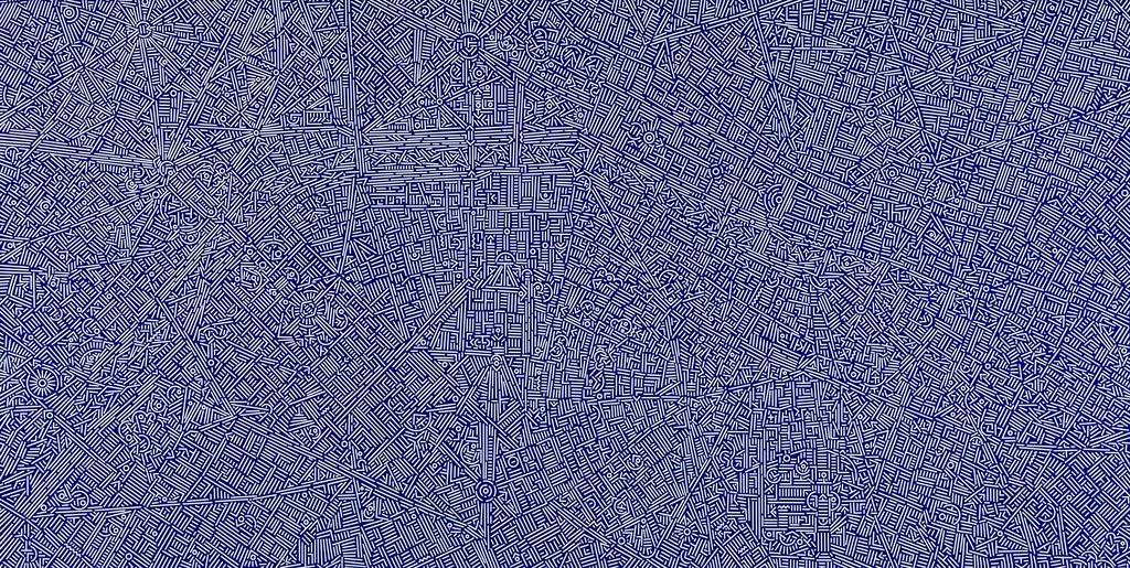
Texture informs the city and the shape of the city itself is textural. When you map the orientation of city streets, you can see immediately which cities have been built in the era of the grid and which have grown over centuries into their own spaces. You can abstract this, take the shape of the streets and form it into a visual representation of the city's DNA. Or you can could study the spaces that are a blank canvas.
Postscript
That was... more than a fortnight. Maybe once every six months is a better time frame, or maybe there's a way to pare this down. Whatever happens, I think we'll look at agave next.
In the mean time, designers, a plea for less san-serif and more sandy fishes carrying rings of gold (Plaine). More gothic helmets that are shaped like angry swans (Westhofe). And perhaps a red hat or two.